A closer look at how the on-chain footprint of bitcoin investors changed in January and how that set a floor price for the recent market downturn.
Dilution-proof, October 1st, 2021
Cycling On-Chain is a monthly column that uses on-chain and price-related data to better understand recent bitcoin market movements and estimate where we are in the cycle. This fifth edition first takes a brief look at factors that provided a headwind for the bitcoin price during September. We then zoom in on an array of on-chain metrics that saw a significant trend change around the January local bitcoin price top, which in hindsight also set a floor price for the recent downturn in the bitcoin market. This column closes off by reflecting on Bitcoin’s current on-chain supply dynamics and macro context.
September Headwinds
After two consecutive months of positive returns on bitcoin during the summer, September provided several headwinds that caused bitcoin’s price trend to mostly move downwards.
After an initial price increase at the start of the month based on positive market vibes related to El Salvador formally adopting bitcoin as legal tender, price crashed hard on “Bitcoin Day,” September 7, when the law went live. The intraday price range that day was -$10,352 (-19.56%), a steep decline that was partially caused by a domino effect of long liquidations that each triggered another forced sell-off that pushed the price down further, liquidating even more long positions. As can be seen in Figure 1, the funding rates (green) on September 7 weren’t as high as they had been in Q1 when market euphoria was still in full effect. However, open interest (blue) had increased quite a bit over the previous weeks and saw a steep drop due to the forced unwinding of over-leveraged longs.
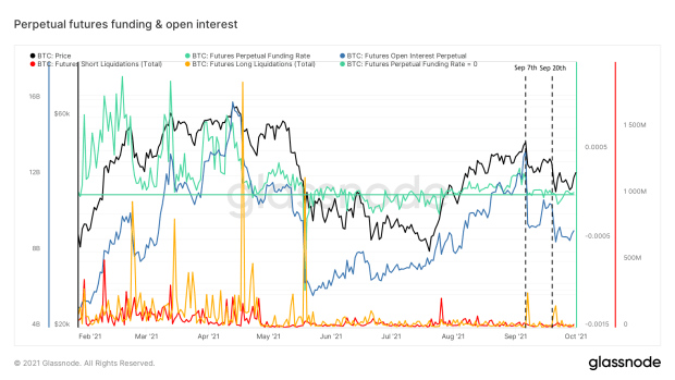 Figure 1: Bitcoin price (black), perpetual futures funding (green) and open interest (blue), as well as the total short (red) and long (yellow) liquidations (source)
That event surely scared some market participants who had not experienced this before or did not understand the underlying mechanics. Subsequently, headlines that Chinese housing giant Evergrande might be on the verge of bankruptcy revived memories of Lehman Brothers collapsing at the start of the financial crisis of 2008. Equity markets saw a significant sell-off on September 20, which was also reflected in the bitcoin price (Figure 1).
Despite these headwinds, the bitcoin price closed just $3,302.45 (7.01%) lower than it opened the month of September, showing some resilience. The bullish on-chain supply mechanics that were described in Cycling On-Chain #4 are still intact, suggesting that patient investors with a low time preference are not selling at these prices. Of course these trends can certainly change, for instance if the current macroeconomic circumstances worsen, but based on on-chain trends, these dips can be considered potentially favorable buying opportunities.
To underline the last point, we’ll use this edition of Cycling On-Chain to zoom out a little and look at an array of on-chain trends that have been present since around the January local top, which was already pointed out in a Twitter thread in early May. We’ll then show that the price levels of that January local top actually also provided a technical price floor where the bitcoin price trend found support during the recent market downturn.
Cooled-Off Prices Since January
First, we’ll have a look at the Bitcoin Price Temperature (BPT). The BPT is a metric that essentially looks at the four-year volatility in the bitcoin price by calculating the number of standard deviations that the current price is from its four-year moving average. As can be seen in Figure 2, the bitcoin price increased rapidly in Q4 2020 (left grey arrow), which resulted in a local top on the BPT (black) at a temperature of 7 in early January.
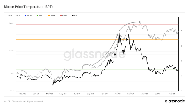 Figure 2: Bitcoin price (grey) and the Bitcoin Price Temperature (BPT, black) (source)
Since then, bitcoin returns started to taper off (right grey arrow) and price temperature started to cool down as a result. This BPT cooling was then exacerbated by the mid-May price crash. Current prices are similar to those we saw during the January local top, but price temperature has cooled down to less than 2, illustrating that these prices are now much more normal on a four-year timeframe than they were in January.
Next, we’ll have a look under the hood and assess a series of on-chain trends that have significantly changed since that same January local top.
Declining Old Coin Movement
One of the trends that have changed since January is a decrease in the amount of relatively old bitcoin that is being moved on-chain, suggesting that sell pressure of experienced market participants is declining. This concept can be assessed using on-chain data in multiple ways.
Perhaps the purest approach is to simply look at the average age of each bitcoin that moves on-chain each day. This is done by a metric called “Average Spent Output Lifespan (ASOL)” that is illustrated in green in Figure 3. As can be seen, ASOL was increasing throughout the late 2020 bull run and clearly peaked around the January local top, after which it has been in a downtrend.
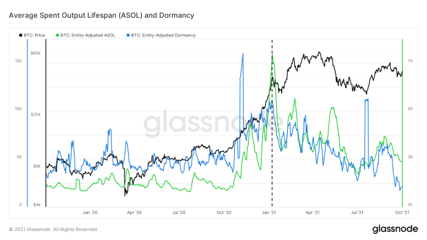 Figure 3: The bitcoin price (black) and the 7-day moving average of the Average Spent Output Lifespan (ASOL, green) and Dormancy (blue) (source)
However, not every on-chain transaction that moves necessarily holds equal weight when it comes to its potential impact on the bitcoin price. After all, a 1,000 BTC transaction has much more potential to influence price than a 0.001 BTC transaction does. This problem is solved by essentially correcting by the actual on-chain volume that was moved, resulting in a metric called “dormancy” that is displayed in blue in Figure 3. With he exception of a few outliers, dormancy has been in a steady downtrend since the January local top. Even more telling, it is currently at levels not seen since early 2017.
Remaining Long-Term Holders Are Now HODLing
Another way to utilize coin lifespan is to determine at what age an unspent transaction output (UTXO) becomes very unlikely to move again. Glassnode did so last year and found that at a coin age of above 155 days (roughly five months), unspent transactions are particularly unlikely to be moved again. As such, coins that haven’t moved for 155 days can be labeled “Long-Term Holder (LTH) Supply.”
Figure 4 displays the 30-day net position change of this LTH supply. As can be seen, coins that are more than five months old were increasingly being sold throughout the late 2020 bull run, as relatively experienced holders were selling into market strength. This sell trend peaked around the January local top, after which LTH sell pressure started to decline and has flipped to strong accumulation over the last few months — despite the steep price dip this spring and early summer.
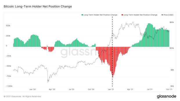 Figure 4: The bitcoin price (black) and Long-Term Holder 30-day Net Position Change (green and red) (source)
Experienced market participants that were skeptical of Bitcoin’s price run towards and break of its previous $20,000 all-time high (ATH) sold heavily against market strength up to the January local top, whereas those that remained afterwards appear to have little intention of selling — again, despite the steep mid-May price drop.
Long-Term Holder Transaction Volume Is Declining
The LTH net position change that we dissected above illustrates the LTH supply dynamics, but it is also possible to assess LTH behavior by looking at their on-chain transaction volume. Figure 5 shows the transaction volume of coins that hadn’t moved in at least six months. The transaction volume of that cohort also peaked around the January local top and has been in a declining trend ever since, with the exception of a temporary spike during the July relief rally that likely consisted of previously trapped investors that were looking for exit liquidity.
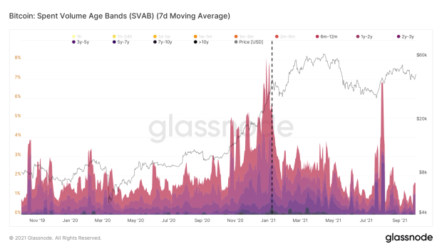 Figure 5: Spent Volume Age Bands (SVAB) for coins with a lifespan of six months or more (source)
Bitcoin’s UTXO Set Is Aging
Besides the coins that are moved (“spent”) on-chain, it is also possible to look at the current status of all UTXOs that exist. This was first done by Dhruv Bansal, who divided Bitcoin’s UTXO set into brackets of different ages, creating a metric known as HODL Waves. This metric was later adjusted by @typerbole, who weighted each HODL Wave by the value each of UTXO when it was last moved on-chain, creating the Realized Cap HODL Waves that are basically a more expressive version of the original metric.
As can be seen in Figure 6, the Realized Cap HODL Waves of coins with an age of up to one month (red colors) trended upwards until the January local top, after which they have been in a steady decline. This shows that up to the January local top, older coins that were previously unspent were being moved on-chain, resetting their lifespan to zero and allowing the bands of the warmer colors in Figure 6 that represent relatively young coins to swell. Since January, these trends have cooled off considerably, allowing the bands of the cooler colors to recede, showing that Bitcoin’s UTXO set is aging again in aggregate.
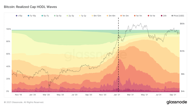 Figure 6: Realized Cap HODL Waves (source)
Declining Miner Sell Pressure
On-chain data also allows skilled analysts to estimate which bitcoin are in the hands of miners. Throughout 2019 and 2020, this data showed that the bitcoin balances that were considered to be in miners’ wallets saw a steady uptrend. Right before the January local top, those balances declined steeply (Figure 7, green), which was followed up by relatively large amounts of bitcoin being sent from those miner wallets to exchanges (Figure 7, blue). Over the past six months, those trends have both reversed, suggesting that miner sell pressure is relatively modest again — despite the hard Chinese crackdowns on miners and resulting dramatic hash rate drop that we saw in May and June.
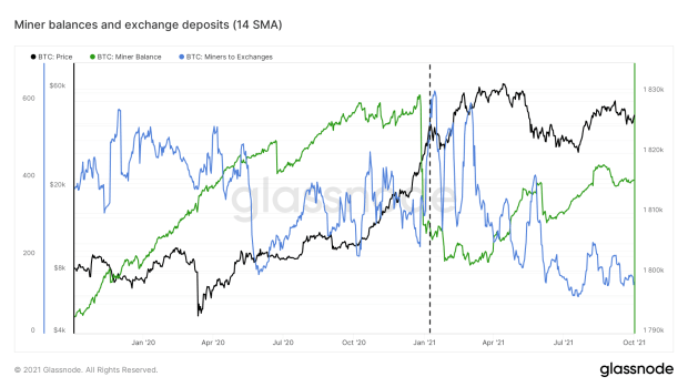 Figure 7: The bitcoin price (black), miner balances (green) and exchange deposits (blue) (source)
The May 19 Capitulation As The Next On-Chain Market Turnaround
The Chinese crackdowns on Bitcoin mining and Elon Musk’s tweet where he announced that Tesla would stop accepting bitcoin had a significant influence on the bitcoin price in the subsequent months. These events scared newer market participants and put an end to the overheated market conditions. This escalated on May 19, where a cascade of long liquidations introduced bitcoin’s first -$10,000 intra-day price move that ended the speculative mania and marked the next large turnaround in bitcoin’s on-chain market structure. The market was cleared from its excess leverage and speculation and the coins of these “weak hands” started moving into strong hands.
Where most of the on-chain metrics that we discussed before provided little to no warning of what was coming, Glassnode’s illiquid supply metric did. By applying algorithmic on-chain forensics, Glassnode estimates which coins are likely in the hands of the same entity. Since Bitcoin’s blockchain is a distributed ledger in which every single bitcoin transaction that was ever made is recorded, Glasnode can look at the spending history of those entities. Entities that flip their coins around all the time (e.g. active traders) are labeled “highly liquid,” those that do so in a slightly more relaxed fashion are labeled “liquid” and the remaining group that has little to no history of moving accumulated coins is labeled “illiquid.”
Figure 8 shows the 30-day net change of that illiquid supply. After the drop from the current $65,000 ATH in late April, a significant decreasing illiquid supply was reported, suggesting that previously illiquid entities were seeking exit liquidity during the early May relief bounce. Elon Musk’s tweet on May 12 and the consecutive Chinese crackdowns then put fuel on the fire, exacerbating a significant price drop that ended in a capitulation event on May 19, which had a similar cascading long-liquidation footprint as was seen in Figure 1.
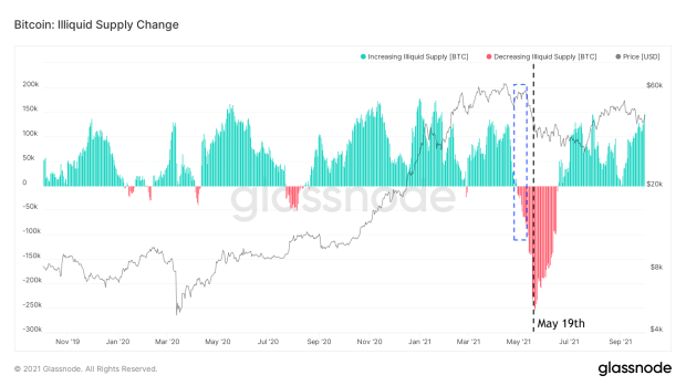 Figure 8: The bitcoin price (black) and 30-day Illiquid Supply Change (source)
That May 19 selloff marked the capitulation of short-term bitcoin price speculators and flushed the market from its excess leverage.
Favorable Bitcoin Supply Dynamics Since May 19
The large amount of previously illiquid coins that were thrown on the market were gradually accumulated by more convinced investors with a lower time preference. A re-accumulation zone was born. Since the May 19 capitulation event, the percentages of all circulating bitcoin supply that are not held not on exchanges (Figure 9, blue) and that are illiquid (green) or are part of the LTH supply (red) are all in an uptrend.
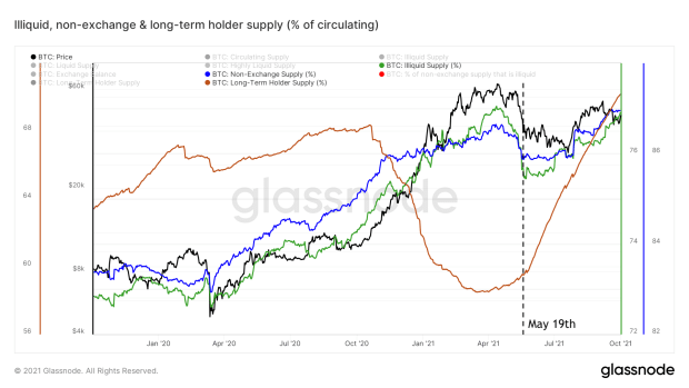 Figure 9: The bitcoin price (black) and the percentages of the circulating supply that are not at exchanges (blue), labeled as illiquid (green) and labeled Long-Term Holders (red) (source)
With a market that is cleared from speculators and excess leverage, these underlying on-chain supply dynamics are the remaining elephant in the room when it comes to estimating where the bitcoin price moves next.
It is important to realize that the trends of these metrics can suddenly turn around and paint a very different picture, as we saw during the mid-May selloff. Therefore, it is not possible to necessarily predict future bitcoin price movements based on these historical trends.
However, the on-chain data is currently very clear in telling us that experienced market participants are in aggregate not looking to sell within the current market context. If these trends continue, it means that an increasing portion of the bitcoin supply is being held by investors with relatively strong hands. Due to Bitcoin’s inelastic supply, this means that if bitcoin demand does increase again, it will be increasingly difficult to buy bitcoin at current prices, as only a limited set of current holders are looking to sell. This is known as a supply shock.
If such a supply shock is indeed forming, it is a bit like holding a beach ball under water while it is being inflated. You can keep the ball under water for a while, but if you slip for just a moment or if the ball is inflated to the point where you can no longer hold it, the ball shoots out of the water. Time will have to tell if current on-chain trends are indeed indicative of the bitcoin beach ball currently being inflated while being held under water, where all dips at this point are being bought — or whether a change in context will (temporarily) deflate the ball and lower its thrust potential.
January Local Top Prices Setting A Technical Price Floor
As mentioned before, the bitcoin price levels related to the January local top and its correction provided key support and resistance levels during the recent market downturn (Figure 10). The May 19th capitulation and cascading long-liquidation event bounced exactly on the price level where the bitcoin market found support (~$30k) after its pullback from the January local top. The price levels of the actual January local top (~$40k) ten provided a clear resistance zone during the subsequent relief bounce(s).
After a supply squeeze was formed between the May 19 capitulation event and mid-July and some of the remaining trapped bears exited their positions during the late-July relief bounce (which we discussed in Figure 5), the $40,000 January local top resistance zone is now being tested for support.
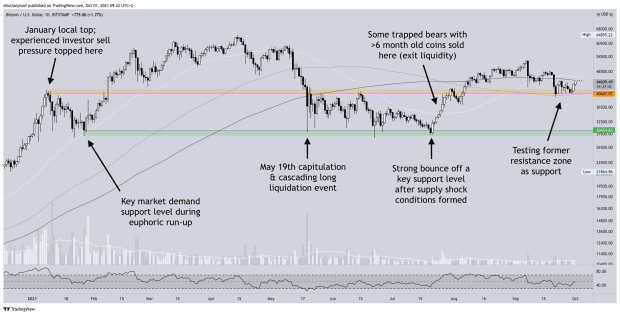 Figure 10: The bitcoin price on Bitstamp and the zones reflecting the top (orange) and bottom (green) of the January local bottom (source)
Have enough STH speculators with weak hands and LTH that wanted to sell below the key $40,000 resistance zone done so for this level to now provide a key support zone?
Figure 11 shows the amount of bitcoin that was moved on-chain at each price level. We can see that a lot of coins moved around the $30,000 and $40,000 price levels, providing further evidence to the claim that these zones are potentially important levels to watch.
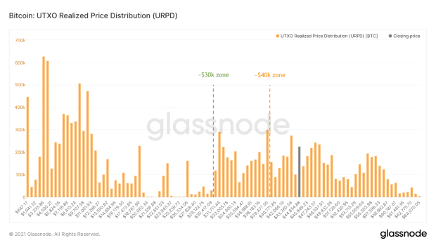 Figure 11: Bitcoin’s Unrealized Transaction Output (UTXO) Realized Distribution (URPD) (source)
Potential Macroeconomic Threats
As mentioned several times throughout this column, while the on-chain trends that are described appear to be quite strong, they can shift the mid- to long-term perspective for the bitcoin price. Current uncertainties in the overarching macroeconomic environment may provide a direct cause for that.
Since June, the U.S. Federal Reserve started mentioning that they are considering, at some point in the future, to turn off some of their money printing presses. Some investors believe that they will not be able to do so without creating havoc in the economy, but the increasing dollar currency index (Figure 12, red/green) since then suggests that others have started to adopt a “risk off” mindset. The more recent uncertainties related to Evergrande, the Chinese housing giant that may be on the verge of bankruptcy, caused even more uncertainties in equity markets, increasing the rotation of money from equities into cash.
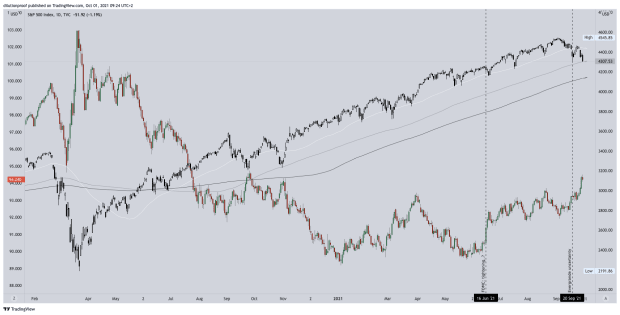 Figure 12: The S&P500 (SPX; black/white) and United States Dollar Currency Index (DXY, red/green) (source)
If macroeconomic circumstances do worsen during the upcoming period and the broader financial markets increasingly go “risk off,” causing an equities selloff, it is likely that the bitcoin price will drop alongside it. If that does happen, it will be very interesting to observe to what extent the on-chain trends that were described in this article remain intact, causing any bitcoin price dips to be bought up quickly. Or conversely, whether experienced market investors will actually start exiting their positions, potentially resulting in a more significant bitcoin bear market.
Current Market Sentiment
I hold a monthly bitcoin market sentiment poll on Twitter. Although the results of such polls always need to be interpreted with a grain of salt due to selection bias, this month’s poll suggests that a portion of the market still has high expectations for the bitcoin price development over the upcoming year (Figure 13).
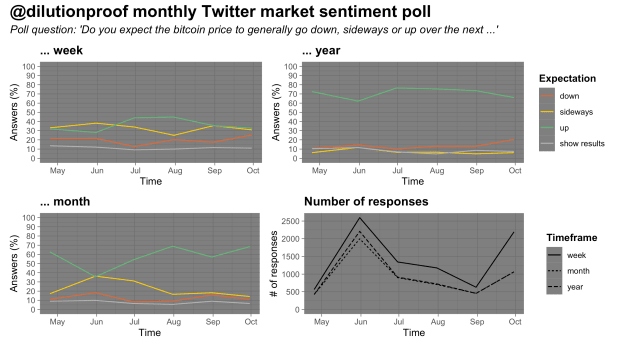 Figure 13: Results of a monthly market sentiment poll on Twitter (source)
Halving Cycle Roadmap
As always, I like to close off this edition of Cycling On-Chain by looking at the Bitcoin Halving Cycle Roadmap for 2020-2024 (Figure 14). This chart visualizes the current bitcoin price, overlayed with the BPT that we discussed above and with price extrapolations based on two time-based models (dotted black lines) — the Stock-to-Flow (S2F) and Stock-to-Flow Cross Asset (S2FX) model (striped black lines) — and cycle indexes for cycles 1 and 2 (white lines) and the geometric and arithmetic averages of those (grey lines). All these models have their own statistical limitations, but together they give us a rough estimate of what may be ahead for the bitcoin price if history does turn out to rhyme once again.
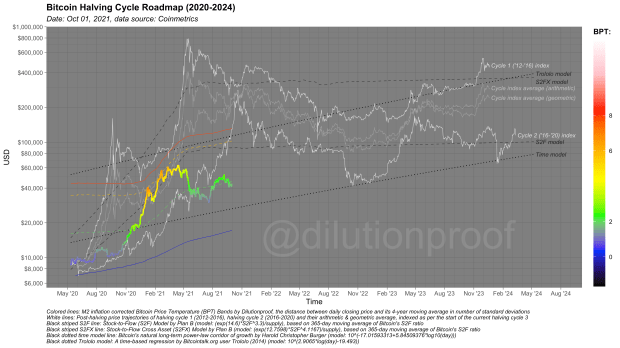 Figure 14: The Bitcoin Halving Cycle Roadmap
Previous editions of Cycling On-Chain:
- #1 Unwinding Leverage (June 1st, 2021)
- #2 Bitcoin Enters Geopolitics (July 1st, 2021)
- #3 Squeezed Supply, Shorts and Bitcoin Lemonade (August 1st, 2021)
- #4 On-Chain Silence Before The Storm (September 1st, 2021)
Disclaimer: This column was written for educational, informational and entertainment purposes only and should not be taken as investment advice.
This is a guest post by Dilution-proof. Opinions expressed are entirely their own and do not necessarily reflect those of BTC, Inc. or Bitcoin Magazine.