It’s rare to find a pitch deck that forces me to dig deep to unearth something to criticize. The last time was with Orange’s seed deck, and in this week’s installment, I had to dive deep into the deck that Super.com used for its $60 million equity, plus $25 million venture debt round.
We’re looking for more unique pitch decks to tear down, so if you want to submit your own, here’s how you can do that.
Slides in this deck
Super.com operated with a deck that tells a great story. It consists of 17 slides:
- Cover slide
- Mission slide
- Traction slide 1
- Traction slide 2
- Team slide
- Customers (interstitial slide)
- Customer profile
- Target customers / market size
- A Savings Super App (interstitial slide)
- Why Now slide
- “Why a super app” slide
- Product slide
- Product road map slide
- User behavior slide
- Solution slide (“SuperCash is core to the experience”)
- Value Proposition slide (“Personalized Experiences”)
- The Ask slide
Three things to love
It’s hard to choose from all the stuff that works in this deck because the Super.com team really knocked it out of the park. But here are three highlights, which, incidentally, are the three most important slides you can have in a pitch deck. I’m utterly unsurprised that the company successfully managed to raise money.
You’ll raise if you’ve got traction…
Super.com starts its pitch with two traction slides in what can only be described as a masterful flex:

[Slide 3] Traction snapshot. Image Credits: Super.com

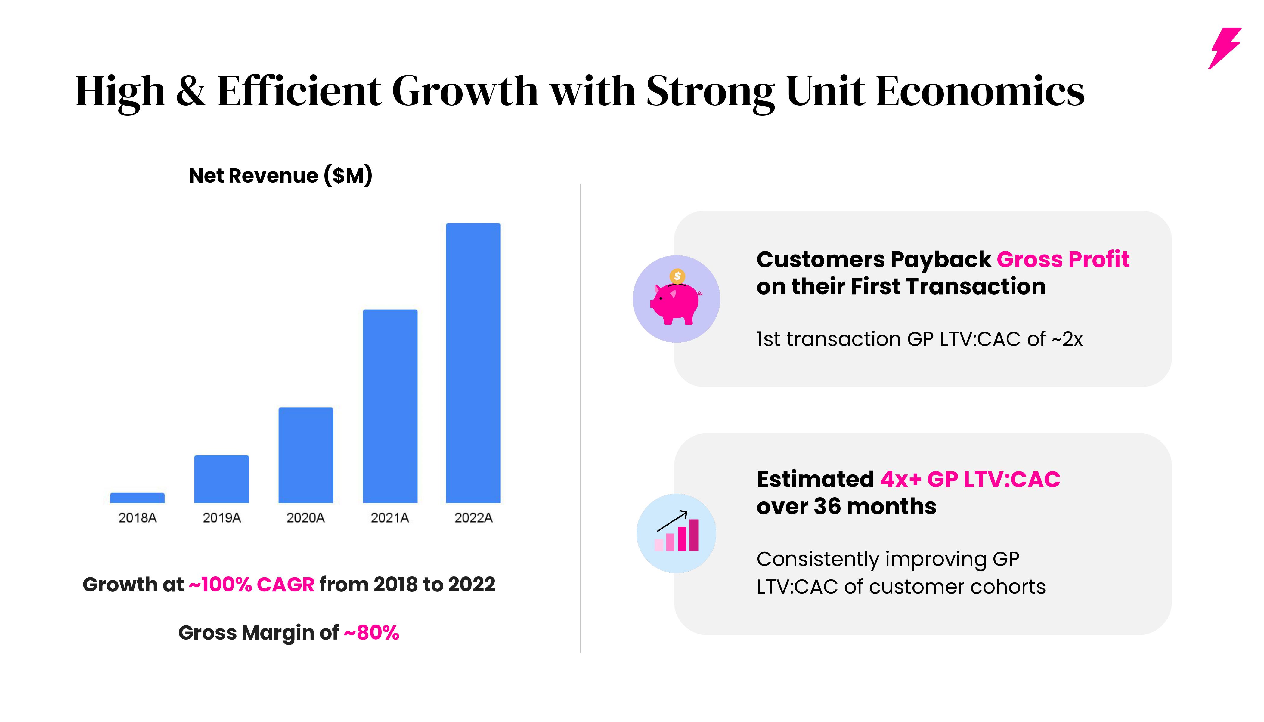
[Slide 4] Traction over time. Image Credits: Super.com
In Slide 3, the company really flexes its stuff: 80 million customers, $1 billion in goods sold, and $150 million in terms of money saved for customers is beyond impressive. But then, in Slide 4, it shows how that growth is accelerating over time.
I’ve said it before: If you can show incredible traction, you don’t really need much else. Super.com does that, but it also has the goods for the rest of its story.
And an incredible team…
Super.com knows its strengths, and it segues from talking about its mission with its traction into a conversation about its team. Co-founders Henry Shi and Hussein Fazal have built a deep bench of incredible team members:

[Slide 5] What a team. Image Credits: Super.com
This is what an absolutely world-class team slide looks like.
Each of the business verticals — travel, finance and the shop — are led by some world-class people, who are all CEO material in their own right. The company’s CFO is ex-Bank of America, and the CMO used to head marketing at Chase.
In addition, the company has attracted Joanne Bradford (president at Honey, COO at SoFi, and head of global partnerships at Pinterest) and Anan Kashyap (ex-CFO at Ethos and Poshmark) as independent board members.
In a huge market
Most of the time, I recommend doing a top-down TAM/SAM/SOM analysis to arrive at your market size, but Super.com chose a bottom-up approach:

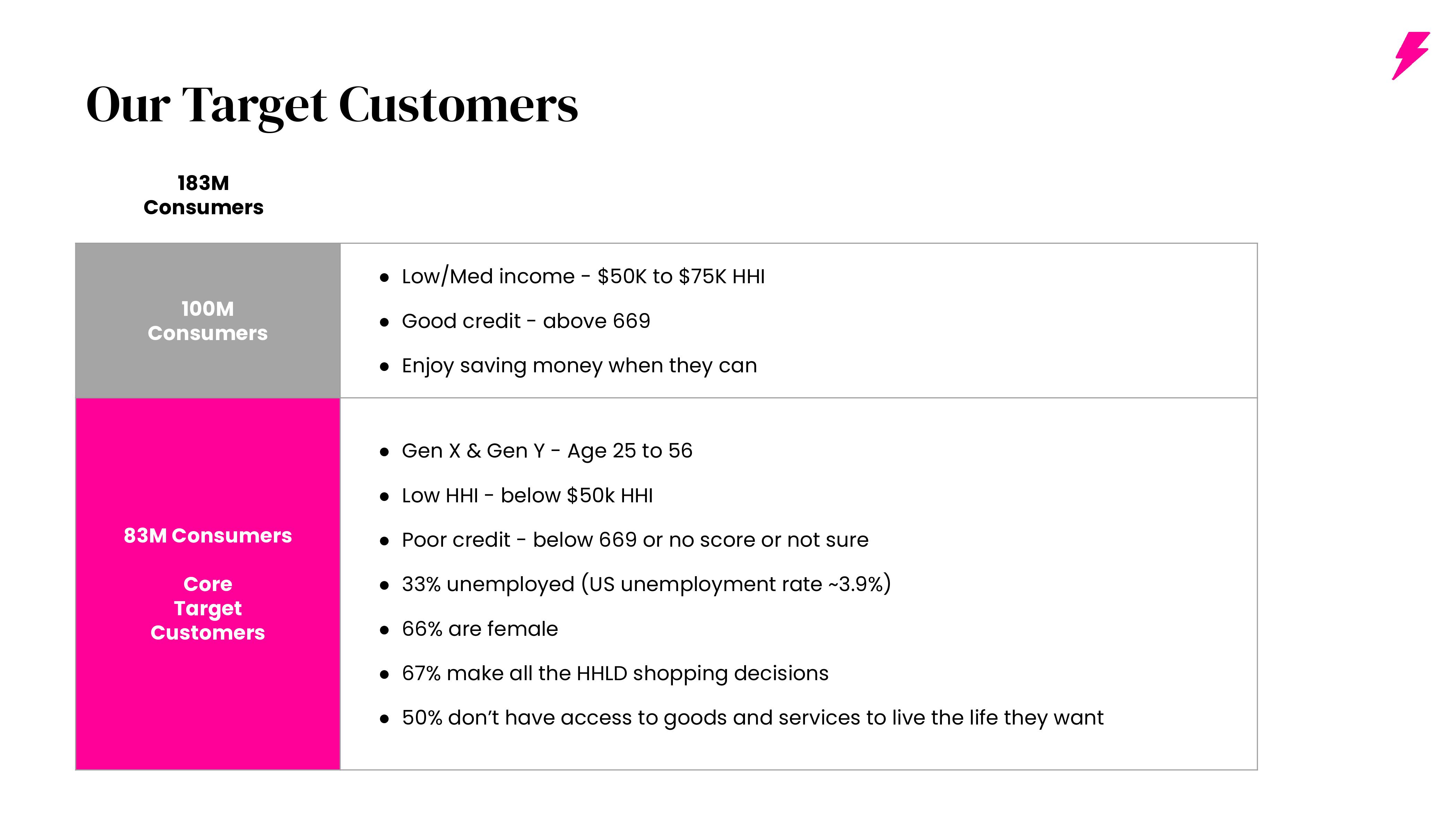
[Slide 8] A slightly unusual market size slide in that it expresses it in customers, not dollars. Image Credits: Super.com
The company says that in the U.S. alone, 25% of the population is its target customer, and it can stretch to around 54% of the population if it expands its reach further.
If this were a pre-seed deck, I’d tell the founders to get it together and do better. But for a company that already has 80 million users, I want to know where it is going to grow. This slide does a good job of answering that question.
The company’s CEO, Fazal, gave me some important context:
We serve the customers who need it the most — typically lower household income, with no to low FICO scores, typically looking to save before they buy. There are about 183 million in that customer base. As we are seeing the wealth inequality gap in the U.S. growing, we have a unique opportunity to make a difference in the lives of more than 100 million Americans. We’re really well-positioned to do this given our active customer base: It’s customer-driven expansion.
That’s a hell of a story.
In the rest of this teardown, we’ll look at three things Super.com could have improved or done differently, along with its full pitch deck!
Pitch Deck Teardown: Super.com’s $60M Series C deck by Haje Jan Kamps originally published on TechCrunch